Abstract Art – Interior Styling Tips
- December 4, 2018
- art, Interior design, Styling
- Comments Off on Abstract Art – Interior Styling Tips
ART IN THE INTERIOR (PART 2.): HOW TO ABSTRACT ART
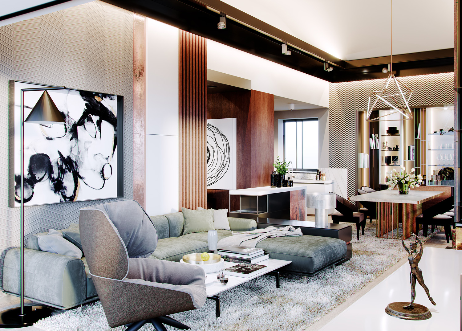
Don’t be afraid to experiment with interior styling and look at abstract art with the eye of a professional! In the second part of our series on art, our interior architects will reveal tips for the correct placement and combination of original art in a space.
Interior styling & storytelling through abstract art
No matter whether you prefer casual, minimalism or extravagance in your interior, abstract art gives you the opportunity to “sign” the space you live in.
Abstract art in commercial spaces
How to properly place original art in the interior
Abstract art hides many question marks not only in terms of selection, but also in terms of its actual placement indoors. Fortunately, there are no strict regulations in this area. You can place it on a blank wall, wood paneling as well as decorative panels.
The point is just not to suffocate your artwork and leave enough “air to breathe” around it. Another clever strategy is to place the abstract image directly on the wallpaper, which provides a suitable “extra” for the artwork. This trick adds extra depth and contrast to your space, making the composition and colour shapes stand out better. If you’re going for a less formal look, try group several images in complementary colour tones next to each other. Don’t be afraid to get creative when choosing a frame that will effectively accentuate the details on your furniture.
Popular trends in abstract art and their combination
Black and white abstracts
Monochromatic art is a category that dominates the world of interior design and architecture in 2018. With its versatile colour palette and sophisticated personality, it represents the ideal of timeless elegance. With its mystical motifs, this type of abstract painting often evokes a feeling of wanting to completely engulf you. And besides the fact that these shades will always be in fashion, they also have one huge advantage. They match any colour base.
Figurative motifs and gestures
The ultimate goal of this type of art is to communicate and embody human emotion. A good example is the works of the French expressionist J.C. Breat (shown below). In his work he effectively combined modern expressionism with a subtle touch of cubism and African mythology. Each of his works represents a different kind of human transformation – the so-called. metamorphosis, taking the viewer away from everyday reality, straight into the realm of illusions and dreams. (If these abstract originals have aroused your curiosity or interest, do not hesitate to contact us and our interior design studio will be happy to arrange them for you.)
The emotions that the creators of abstract art pour into their works – whether it is love, passion, anger or sadness – take on a whole new meaning through the eyes of the viewer. The diversity and paradox of human emotion can also be expressed in painting through the use of distinctive dividing lines and the technique of “colour blocking”, which is particularly typical of Cubist art.

Soft focus art
The top three in the field of artistic abstracts are complemented by “soft focus” art, the so-called. the art of fine focus. This type of artwork focuses mainly on the play of shadows and colour transitions. This art is not too shouting or too passive, it cares above all about the right emotional charge in the space.
When it comes to combining different artistic styles, we recommend that you follow your intuition and do not combine more than three different styles in your interior. Besides, it will always be your free choice. So don’t be afraid to hang a modern creation next to a classic, or a bold figurative piece near a subtle colourful composition.
All that matters is the synergy between the artworks in question, not their relatedness or similarity.

If you have any further questions regarding the selection and placement of art in the space, please do not hesitate to contact us. Our team of architects will be happy to advise you and provide you with years of proven know-how in the design and realization of customized interiors. In the third article of our art series, we look at art as an investment object.
With love for art,
Your FMDESIGN team


